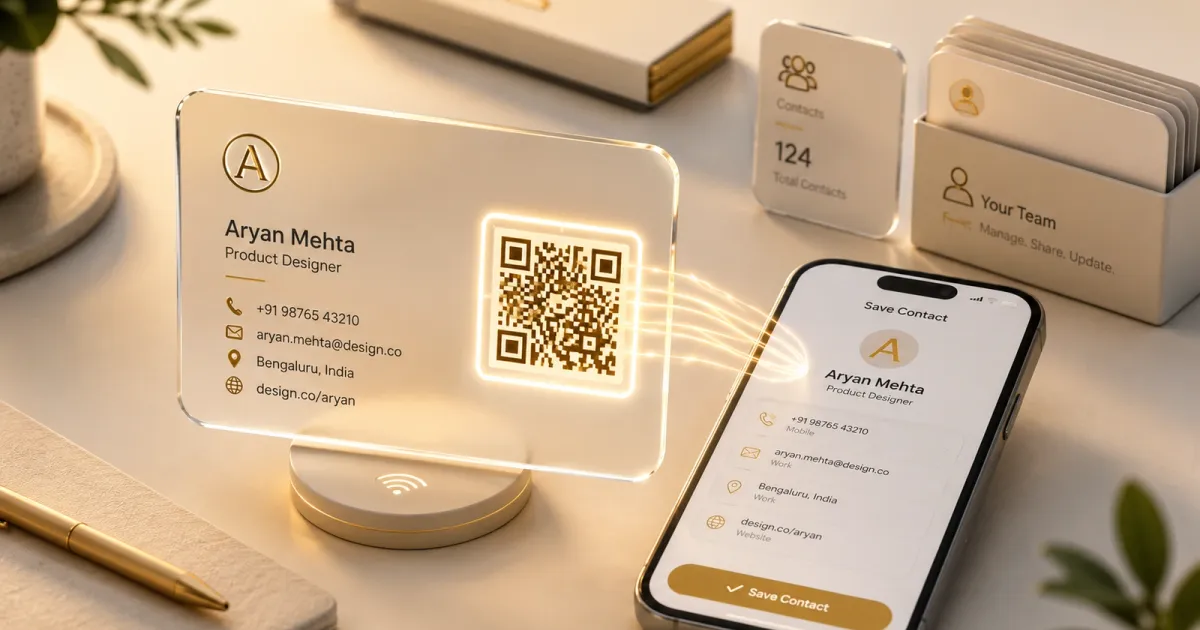
A paper business card is dead the moment it’s printed. The number changes, the title changes, the card gets lost in a drawer, and even when it survives, the person you handed it to still has to type everything into their phone by hand. The whole ritual is friction at the exact moment you’re trying to make a good impression. This is the digital replacement: a card that lives at a URL, updates whenever you want, and saves itself to a recipient’s phone in a single tap.
How it works
The flow is split cleanly between the people who run it and the people who receive it:
- An admin dashboard where you create and manage contact profiles (name, title, location, phone, email, website), each with its own slug, all behind Better Auth.
- A branded QR code per contact, generated with a configurable logo dropped into the center, so the thing you print or display on a screen still looks like your brand rather than a generic black-and-white square. Getting that logo to sit cleanly in the middle and still scan reliably was the fiddly part. It meant leaning on the QR’s error-correction headroom and sizing the logo and its padding so it reads instantly while still looking polished.
- A public, mobile-first contact page at
/c/[slug]that anyone can open by scanning the code and a one-click vCard download that writes straight into their phone’s address book. Making that seamless on both Android and iOS took real care: the two platforms are fussy about vCard formatting and how they trigger the native “add contact” sheet, so I tuned the output to drop into either one cleanly. No typing, no app, no account.
Every card is just a link you control
The quiet strength of the whole design is that a card is nothing more than a URL the web app owns. QR is one way to reach it; an NFC tag is another. Tap-to-share works out of the box, because the tag only ever holds a link. And since that link is controlled centrally rather than baked into the physical object, the interesting capabilities come for free: you can re-point or update a card without reprinting anything, gate who can manage what with role-based access, and measure how often a card is actually opened. The physical thing stays dumb on purpose; all the intelligence lives in the app.
The decision I’m happiest with: white-label by design
I first built this as a demo for a single organization, then generalized it. The part that turns it from a one-off site into an actual product is that nothing about the brand is hard-coded. App name, organization name, description, default website, and logo all resolve from a single centralized config backed by NEXT_PUBLIC_* environment variables. Standing it up for a different company is genuinely three steps: drop in a logo, set a handful of env vars, redeploy. It takes zero code changes. I designed it this way so the same codebase can quietly power a digital-card system for many organizations, each looking entirely like their own.
And because a card is just a structured contact record, provisioning scales the same way an org already runs: it’s straightforward to wire up to SSO and existing HR data systems and mint cards for an entire company in bulk, rather than creating each one by hand. A new hire’s card can exist the moment they’re in the directory.
Under the hood it’s a Next.js 16 (App Router) + TypeScript app with Drizzle ORM over a serverless Neon Postgres database, Better Auth for the admin side, the qrcode library for generation, and a shadcn/Radix UI on Tailwind v4, deployable to Vercel in minutes.