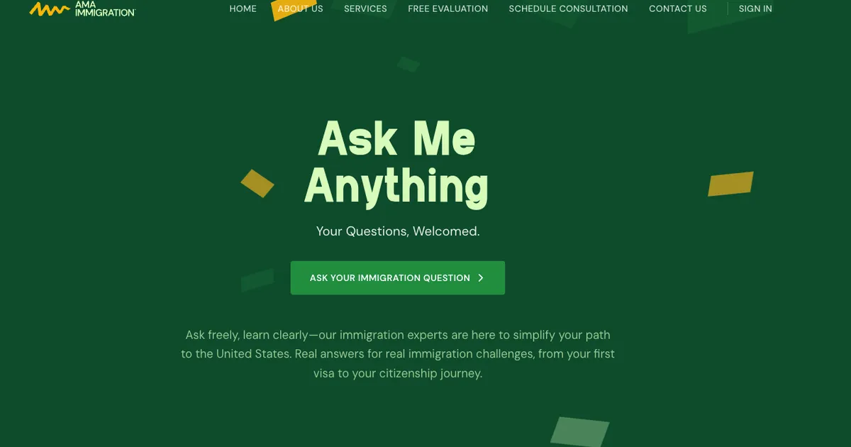
Immigration is paperwork that quietly changes someone’s whole life, and most firms make it feel cold. Clients get left in the dark: unsure what stage their case is at, buried in jargon, emailing documents into a void and hoping someone received them. AMA Immigration’s entire pitch is the opposite of that: “Ask Me Anything,” “Immigration made human.” So anything I built for them had to feel that way, not just claim it.
Designing warmth into a category that defaults to cold
The first problem was aesthetic, and it mattered more than it sounds. Law firms online almost all look the same: corporate blues, stock photos, a wall of authority. The client’s vision was the opposite: warm, human, approachable. They trusted me to translate that feeling into a real interface. So I leaned on the firm’s immigration-green palette and custom display type, and reached for soft, ambient background animations to give the site a sense of gentle forward motion. The constraint I set myself was that warmth could never cost performance: the motion is pure lightweight CSS, so the site stays fast while still feeling alive and reassuring rather than sterile.
Scoping up from “a marketing site” to a product
What the client asked for was a simple marketing site. But once I actually understood how the firm worked, with cases tracked in their heads and documents and updates scattered across email and WhatsApp, it was clear a brochure wouldn’t move the needle for them. So I made the case for building more: a lightweight client portal and an admin panel on top of the public site. I argued it would change how clients perceive the firm, turning an anxious, opaque process into something they can log in and watch progress on, and that the operational leverage for a small team would be worth far more than another pretty page. They agreed, we built it, and they’ve been running on it successfully since.
The portal: never leave a client in the dark
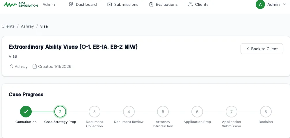
The heart of the system is eight-stage case tracking, from first consultation through to decision. A client logs in and sees exactly where their case stands and what’s next, directly answering the anxiety the whole brand exists to remove.
Around that runs everything an operating firm actually needs:
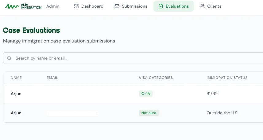
- An admin panel that replaced the email-and-WhatsApp scramble. Staff review incoming case evaluations, manage submissions, and walk each client through the eight stages from one place instead of juggling clients across inboxes and chat threads. For a small firm, it’s the difference between feeling scrappy and feeling genuinely professional.
- Bidirectional document management. Clients upload what’s requested; admins push back forms and filings. Files live in Cloudflare R2 and move through short-lived signed URLs, so sensitive immigration paperwork goes straight to and from object storage rather than proxying through the app.
- Role-based access from day one. Better Auth backs a clean user/admin split, so what a client can see and what staff can do are enforced, not implied.
- Booking that schedules itself. Rather than the usual evaluation-form-then-manual-back-and-forth, I convinced the firm to embed Cal.com’s inline widget directly in the flow. A client picks a time and the call is automatically scheduled on both sides: no email tag, no manual calendar entry.

Quality-of-life touches that make a small firm feel big
A lot of the polish lives in the automations a busy team would otherwise do by hand. When a client books a call, a branded “thanks for booking” email goes out automatically through Resend. When the firm needs paperwork, requesting documents from a client is a single action that emails them directly. And onboarding is invite-driven: admins invite a client by email, and the invitation and password-setup mail go out through Resend too, so a new client’s very first touch with the portal is clean and branded instead of a generic signup.
Under the hood
It’s a single Next.js 16 (App Router) + React 19 app on Bun, with Drizzle ORM over serverless Neon Postgres, Better Auth for authentication and roles, Cloudflare R2 for documents, Resend for transactional email, and Cal.com for scheduling, all deployed on Vercel. This is a stack I’m deeply comfortable in, which is exactly why I could afford to expand the scope: the marketing site and the operational portal ship as one codebase, so the brand’s promise of clarity is something a client can actually log in and see.